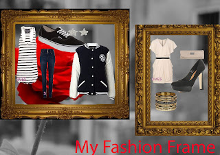
 For my fashion page i had to get a new A4 document then paste the frames but since the inside of the frames was black i had to quick mask the gold fame itself to get rid of the original black background . Once that was done i place a picture of on type of clothing the i had to quick mask around it to get rid of its whit back ground to make the work look professional, when i had done all of the quick masking i resized the clothing , accessories and shoes so it could fit it inside of the frame. Then when that was all done i place the clothings layered on top of each other so it could have a nice effect. Finally when that was all done i added a background by getting a suitable picture the going onto the background tab and resizing the picture so it would fit properly on the document and sent the background picture to the back so all of the fashion fames and clothings would come to the front.
Thursday, 20 October 2011
Fashion Frame
 For my fashion page i had to get a new A4 document then paste the frames but since the inside of the frames was black i had to quick mask the gold fame itself to get rid of the original black background . Once that was done i place a picture of on type of clothing the i had to quick mask around it to get rid of its whit back ground to make the work look professional, when i had done all of the quick masking i resized the clothing , accessories and shoes so it could fit it inside of the frame. Then when that was all done i place the clothings layered on top of each other so it could have a nice effect. Finally when that was all done i added a background by getting a suitable picture the going onto the background tab and resizing the picture so it would fit properly on the document and sent the background picture to the back so all of the fashion fames and clothings would come to the front.
3 column Lay out
This is my 3 column layout. To make this i had to open a new A4 document with 3 columns, then put the text wrap box in each column and then another one in the top left hand corner so i could paste the Mindless Behavior picture. Once the text wrap boxes were add i also added rulers to line up the text so the would not spill out of place, then after that i added my picture in the left hand corner and also by putting a text box for the words i added the text by filling it with place holder text.
Gaga layout
This is my lady Gaga Page layout. to make this on indesign i had to open an A4 document, and add 3 column on to the page. in the middle column i put a text wrap box so i could paste the Picture. Once i pasted the picture i i added text into my 3 columns then i used the pathway tool to make a path around the gaga picture so then the words around the picture would mould into place.
Vibe Magazine Cover.
This is My Rhianna Vibe magazine cover.to make it i had to firstly open a new A4 document and inserted the rhianna picture, then i masked around it to make sure it looked neat in the finished design. omce masking the photo i flipped it so the picture could be the other way, after that i had to change the filter to black and white. When that was done i added bold text and a blue background so it could give it a finishing look.
Subscribe to:
Comments (Atom)


